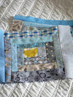
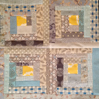
Turns out I don't do wonky all that well as three of the four centre blocks were almost dead centre, with one outlier (see upper left).
For a while I thought that I might be able to get away with it but the longer I looked at it (as I snacked on butterscotch pie...) the more that fourth block just looked like a mistake. Nothing to do but fix it. So, I ripped that block out, narrowed the outside grey strip and added a wide blue strip. Now they all look like they might have something in common.

Seemingly on a roll, I prepped it for quilting. I like to use up batting trimmings for my toppers and joined two pieces with a zigzag stitch.
The first half went beautifully, just doing randomly spaced lines of quilting, but when I moved to the second half I was several rows into it before I realized that I had stitched a lovely pleat into the backing. ARRRGH! More ripping.
 Patience ruled the day and it is now finally quilted and bound, and actually quite pretty.
I like the way that the binding print moves in and out of the two shades of blue - sort of helps with that wonky thing...
The backing is from the same print as the binding. It's an Art Gallery fabric and was soooo lovely to work with.


2 comments:
It is funny when we try to be a bit more improv all those sewing skills just can't. Wonky or not your topper is cute and done!
Every time I see this color combination I like it more. Your binding is the perfect choice. So soft and simple. Congratulations.
Post a Comment